copo americano (Brazilian faceted glass)
/ repositioning a classic
Repositioning and strategy: from digital to trade.
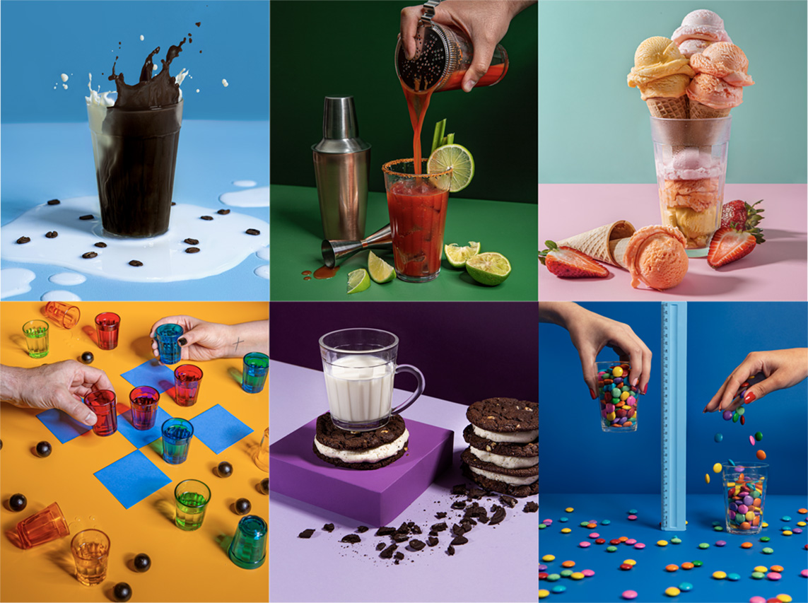
The Brazilian faceted glass (Copo Americano) is an icon. It can be found at homes, bars and restaurants all across the country. But being a classic does not mean it needs to be obvious. In order to change the way this story is told, we proposed a new perspective on this special icon to Brazilians.

The product has taken up the leading role in unexpected situations, suggesting new situations in which it could be used and different moments in which it could be consumed. The approach bet on the idea that it is a problem to go way beyond beer and coffee to reinforce this love brand’s attributes in an original way. The creative line and the aesthetic routes brought out the brand’s laidback character and stood out in the most on the already crowded young people’s feeds.


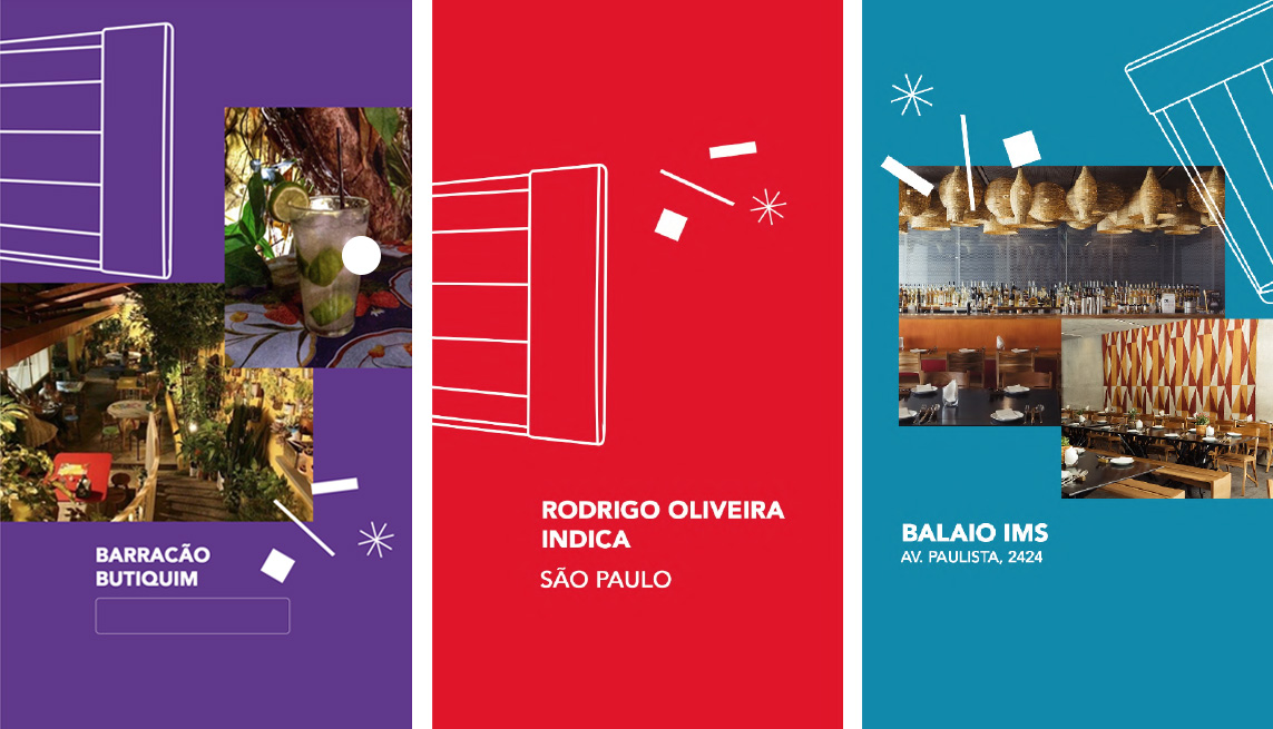
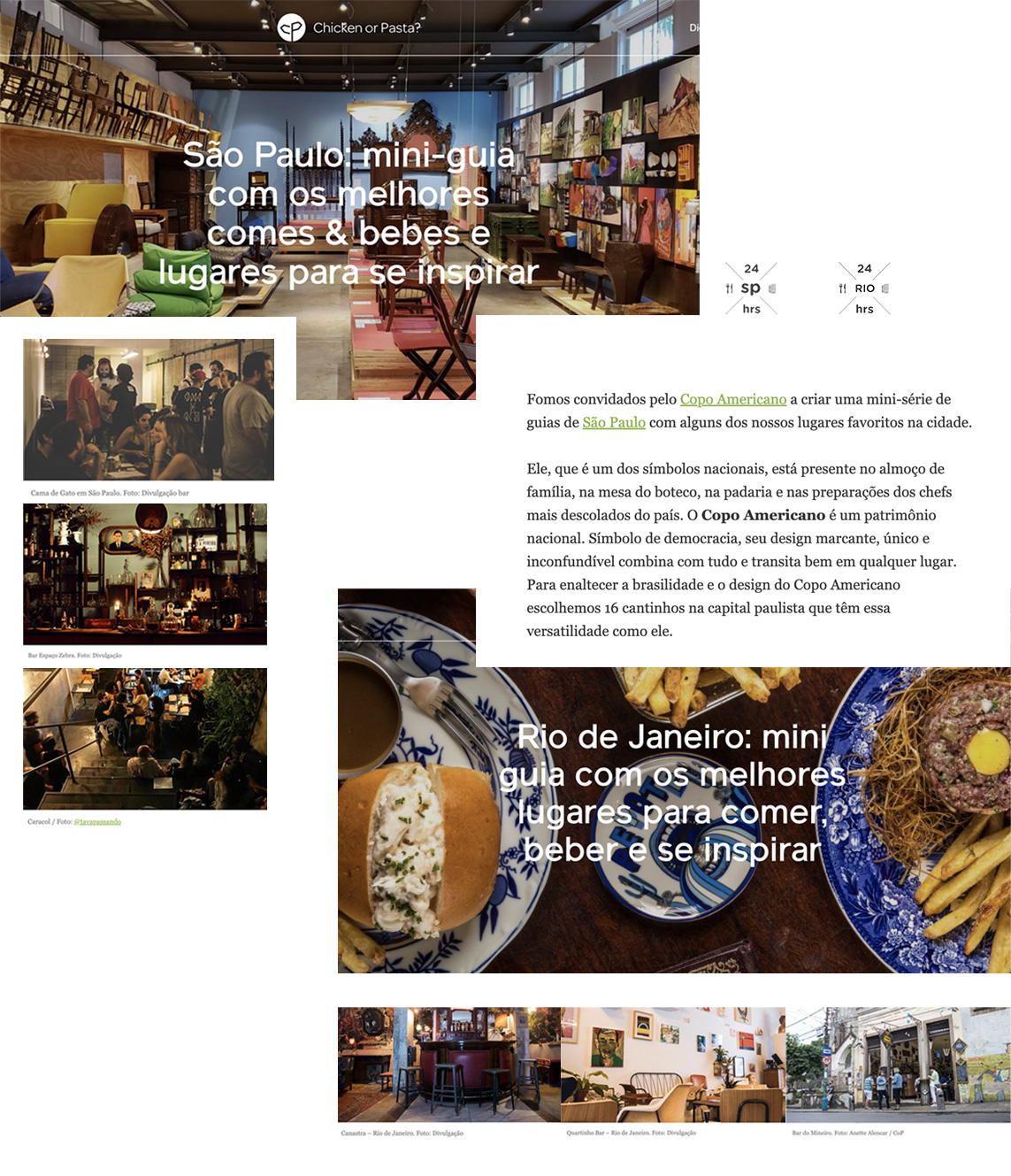
In addition to each curator’s preferred places, the series included backstage content, conversations and curiosities about the team, recipes of the flagship cocktails to be prepared in the Brazilian faceted glass, cocktail challenges and much more. In order to expand the concept, we also established a partnership with Chicken or Pasta, which created their own Copo Indica mini-guide for each capital city.

In addition to fostering engagement and encouraging the audience to explore the city, this campaign unpretentiously elevated the status of Copo Americano and its status as a design object that naturally moves around the worlds of cuisine and mixology, as well as music, art, traveling, architecture and lifestyle.


